|
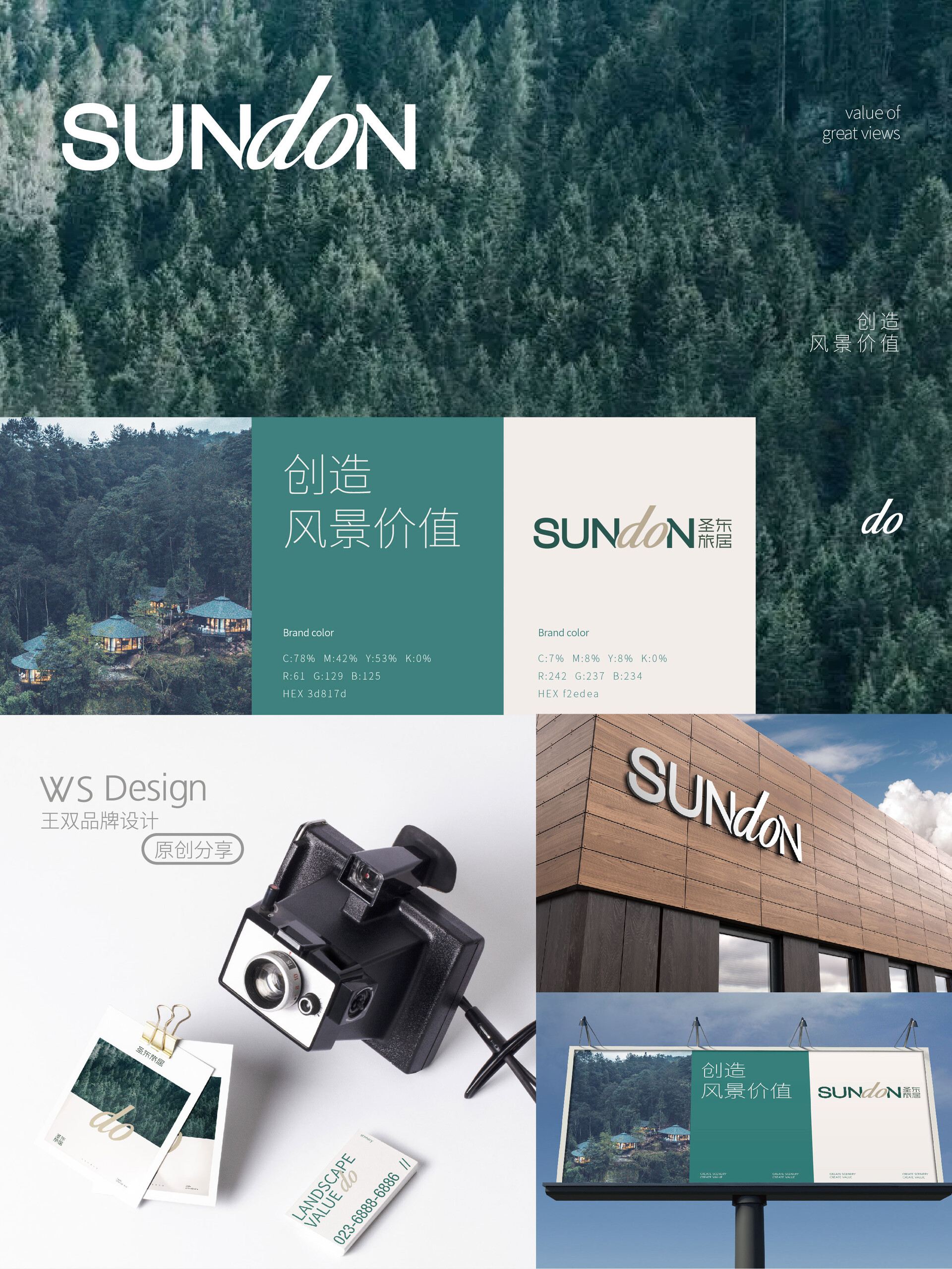
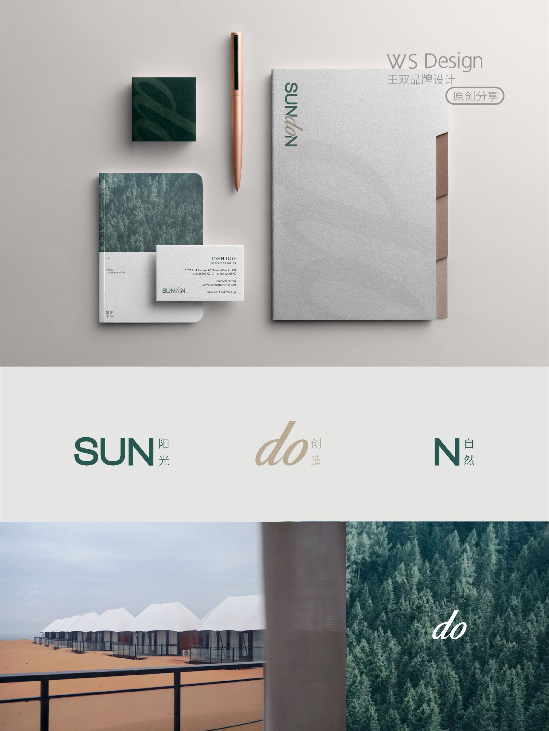
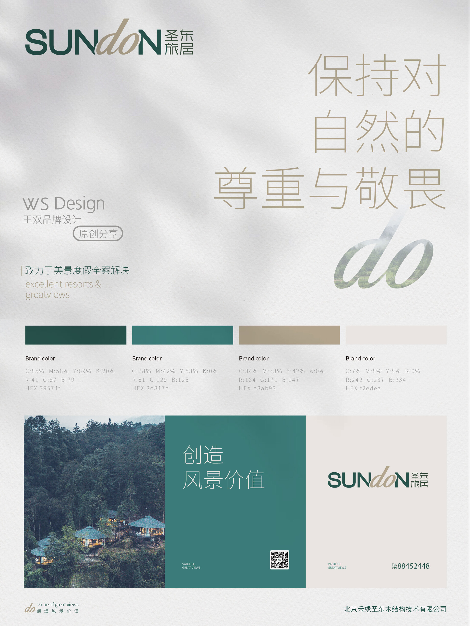
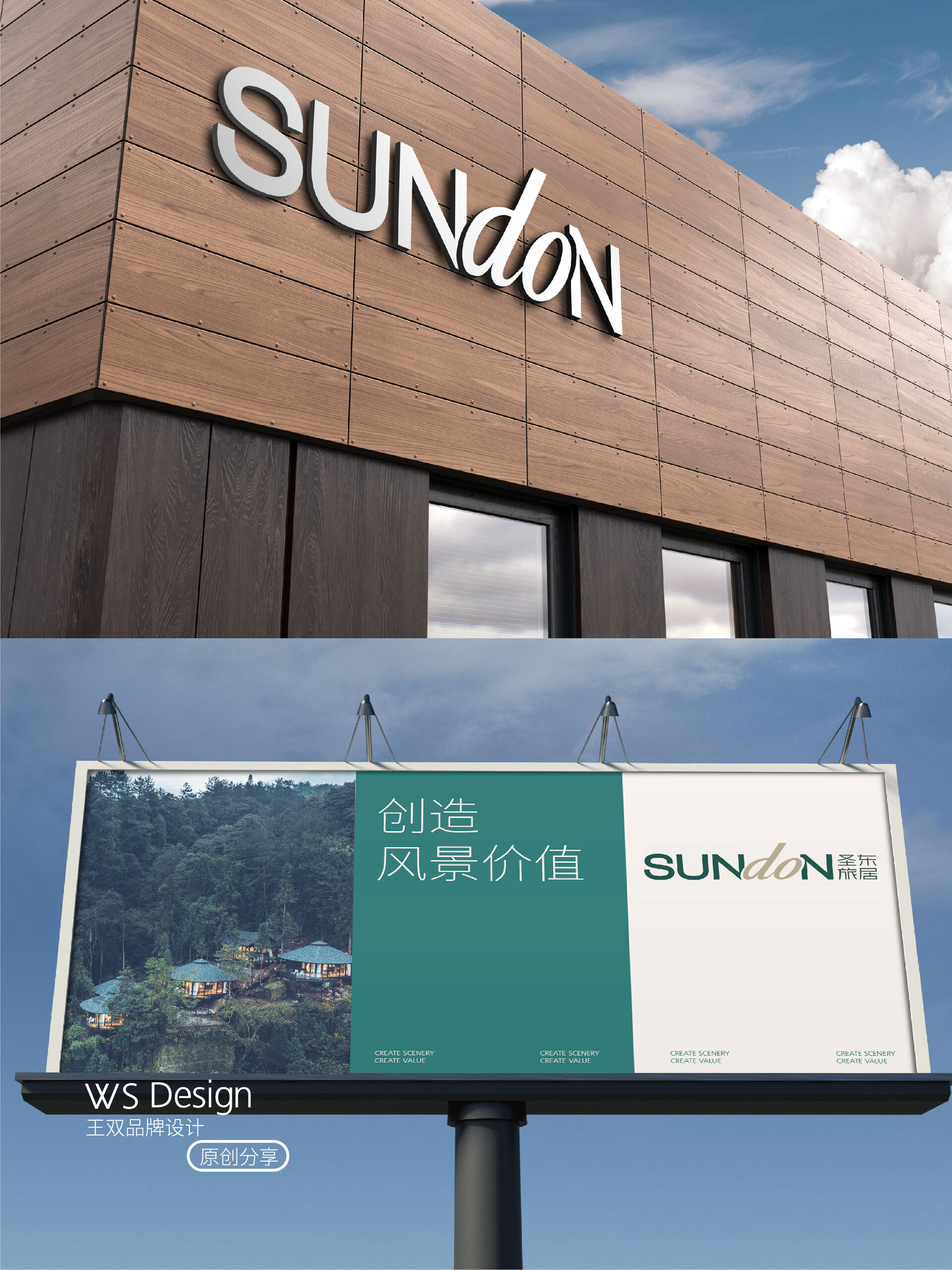
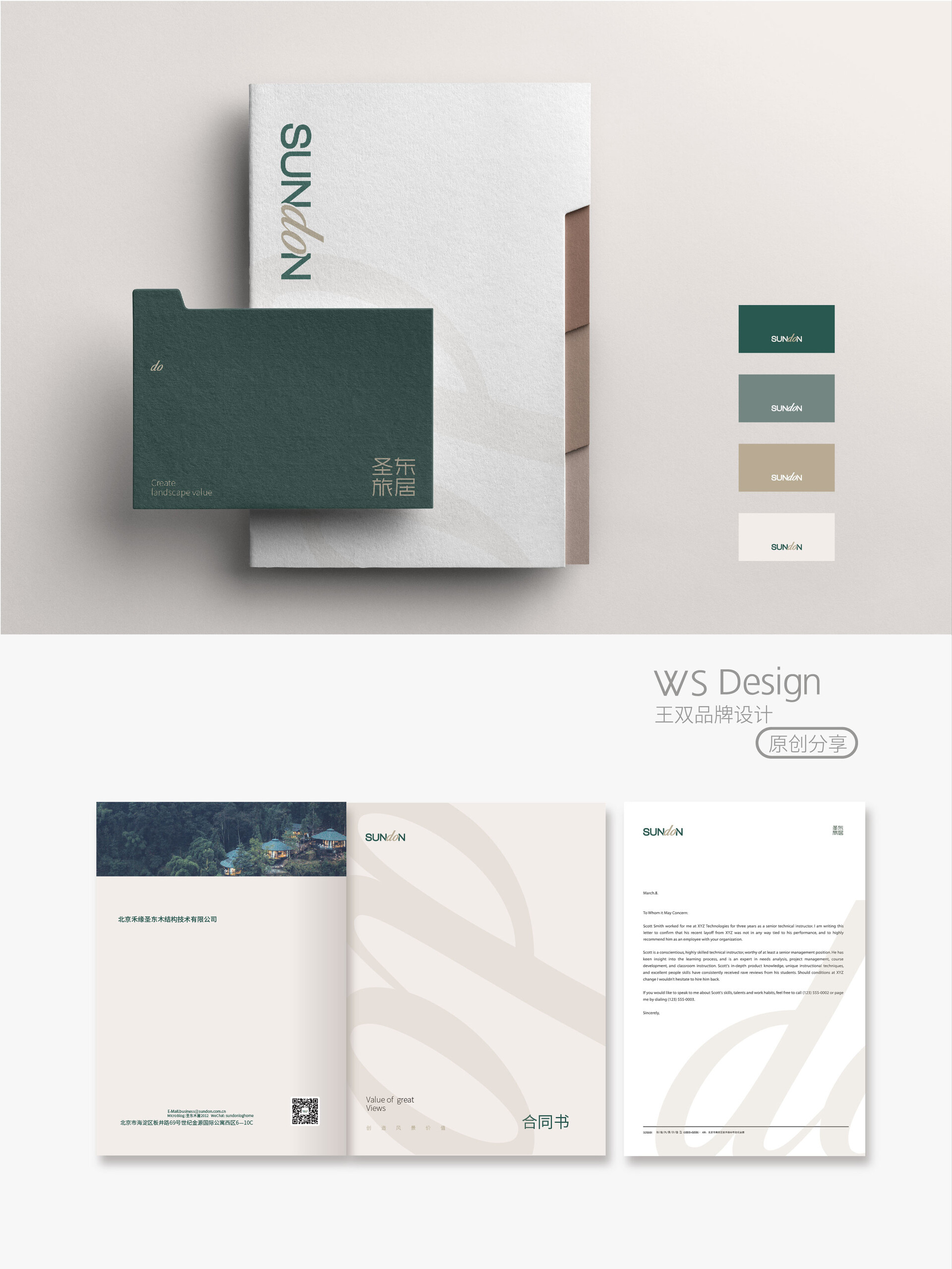
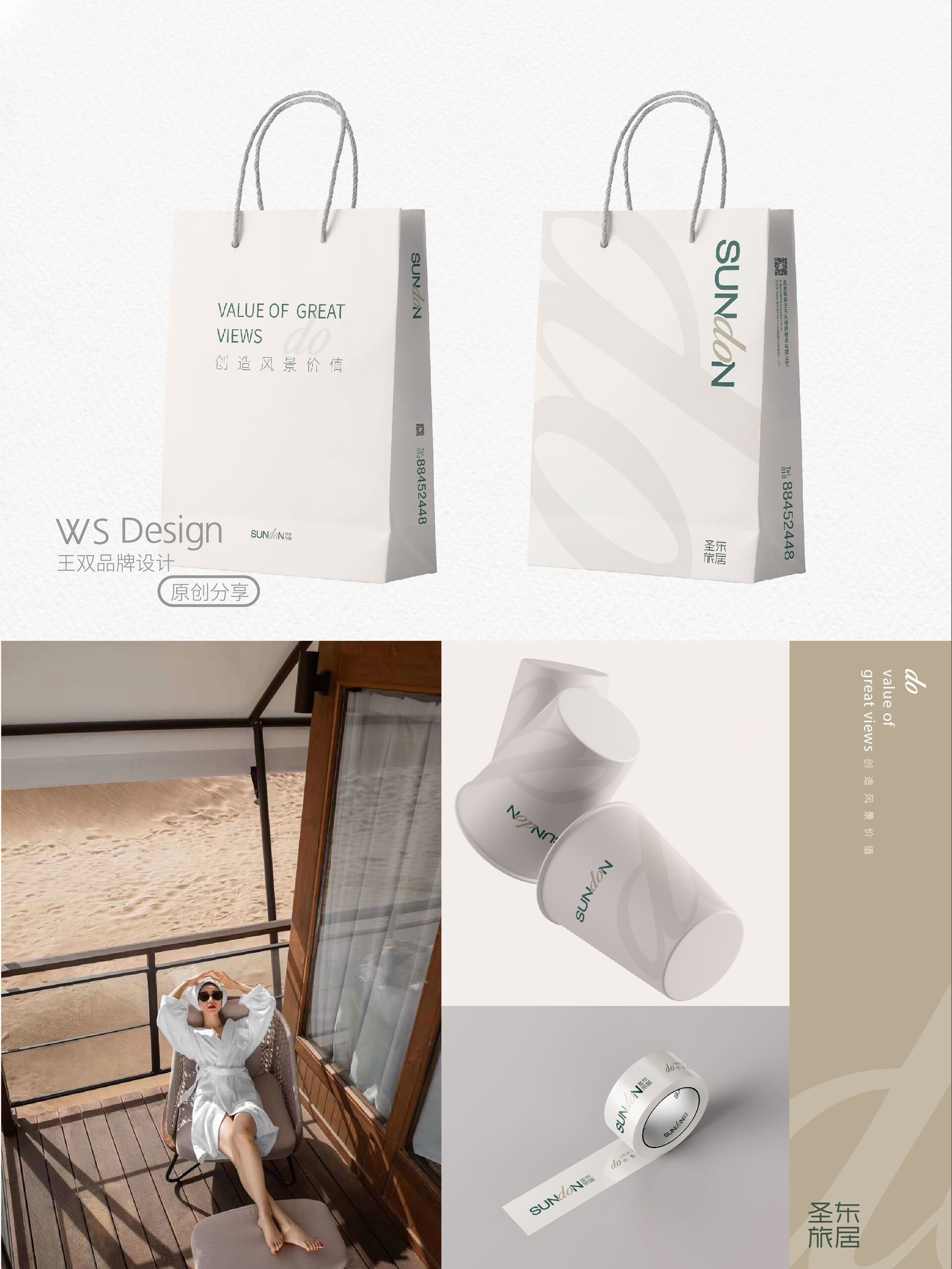
品牌视觉全案设计 | 圣东旅居品牌视觉全案设计 | 圣东旅居 Brand visual design | Shengdong Travelling 圣东旅居是一家美景度假全案服务机构,一直将“创造风景价值”作为度假全案服务的核心理念,敬畏自然、尊重土地、关注生态,最大限度地控制对自然和生态的破坏,放大风景本身的价值。同时秉承:轻资产的滚动开发逻辑和一切为了体验的设计原则。 从2005年至今,打造出诸如卡莎莎(2022雪鹿奖·年度乡建榜样)、沙坡头星星酒店(中国最佳旅游规划设计奖、中国酒店星光奖、亚洲最佳旅游度假酒店)、云屯星空树屋野奢酒店、云峰山童话树屋酒店等全国知名的风景度假项目。 这次,我们有幸为圣东旅居做了形象升级,打造全新的品牌vi系统。 本次升级,我们考虑到圣东旅居致力于在全球范围内提供风景度假全案服务,所以选择更具国际化的品牌英文名“sundon”为LOGO的设计主体,着力表现“do”。 “do”是行动,也是圣东旅居的核心价值,即持续的创造力与解决力,提升风景价值。 “sun”太阳,代表一种向上的精神,是圣东旅居永远创新的力。 “N”代表自然·联合,正是圣东旅居目前做的事情–可持续的美景度假运营策略。整体logo以更现代化,简洁的方式传达出圣东的企业精神和核心事业。以森林绿为主品牌色,展示出对大自然的敬畏。以原木色为次品牌色,表达出圣东不是改变大自然,而是通过木元素来创造价值。 Shengdong Residence is a full-service holiday resort agency that has always been committed to "creating scenic value" as the core concept of its full-service holiday resort. It respects nature, respects the land, and focuses on ecology, maximizing the control of damage to nature and ecology, and amplifying the value of the scenery itself. At the same time, it adheres to the rolling development logic of light assets and the design principle of all for experience. Since 2005, it has created well-known scenic vacation projects such as Kasasa (2022 Snow Deer Award for Rural Construction Model), Shapotou Star Hotel (China's Best Tourism Planning and Design Award, China Hotel Starlight Award, Asia's Best Tourism Resort Hotel), Yuntun Starry Tree House Wild Luxury Hotel, Yunfeng Mountain Fairy Tale Tree House Hotel, etc. This time, we are honored to upgrade the image of Shengdong Travelling and create a new brand VI system. For this upgrade, we took into account that Shengdong Travelling is committed to providing comprehensive service of scenic vacation around the world, so we chose a more international brand English name "sundon" as the design subject of the LOGO, focusing on expressing "do". "Do" is action, as well as the core value of Shengdong Travelling, which is continuous creativity and problem-solving, enhancing the value of landscapes. "Sun" represents the sun, a spirit of upwardness, and the forever innovative force of Shengdong Travelling. "N" represents nature·union, which is what Shengdong Travelling is currently doing - a sustainable operation strategy for beautiful landscapes. The overall logo conveys the corporate spirit and core business of Shengdong in a more modern and concise way. The main brand color is forest green, showing respect for nature. The secondary brand color is natural wood color, expressing that Shengdong does not change nature, but creates value through wood elements.
|

