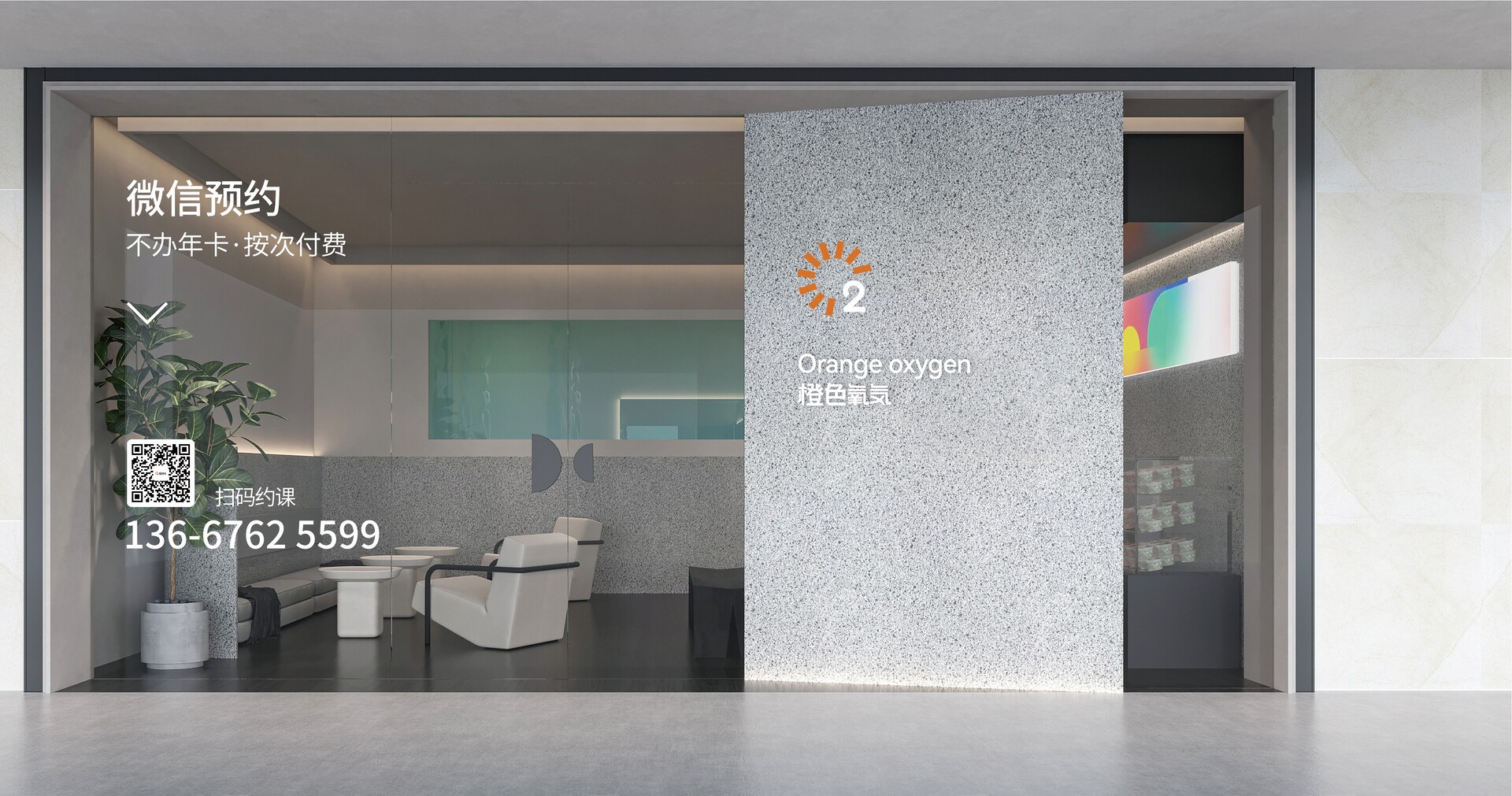
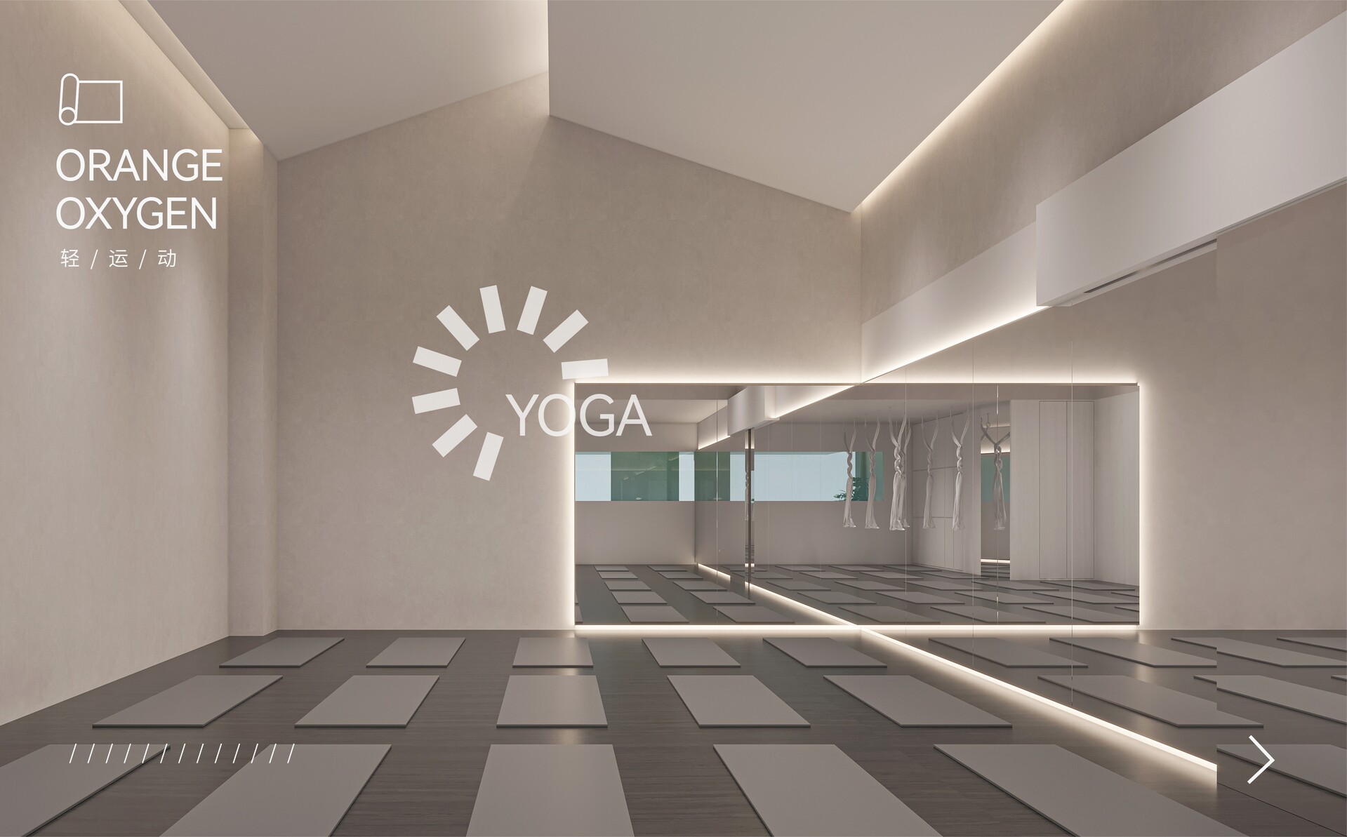
品牌视觉全案设计 | 橙色氧气瑜伽馆
Brand Visual Full Case Design | Orange Oxygen
瑜伽在人们心目中,是烦劳的工作生活之余,回归自然,享受属于自己安宁时刻的一项运动。一个真正以消费者健康为目的,让消费者能卸下压力,放松身心的瑜伽空间,才是瑜伽馆应该具备的东西,本次项目的设计,应站在消费者的角度,在视觉上优化体验,满足其心理预期和心理需求,才能成为消费者们安心选择的对象。
品牌名符号化,能让消费者迅速将LOGO和品牌进行联系,从而迅速建立起对品牌的认知,为占领心智打下夯实的基础。
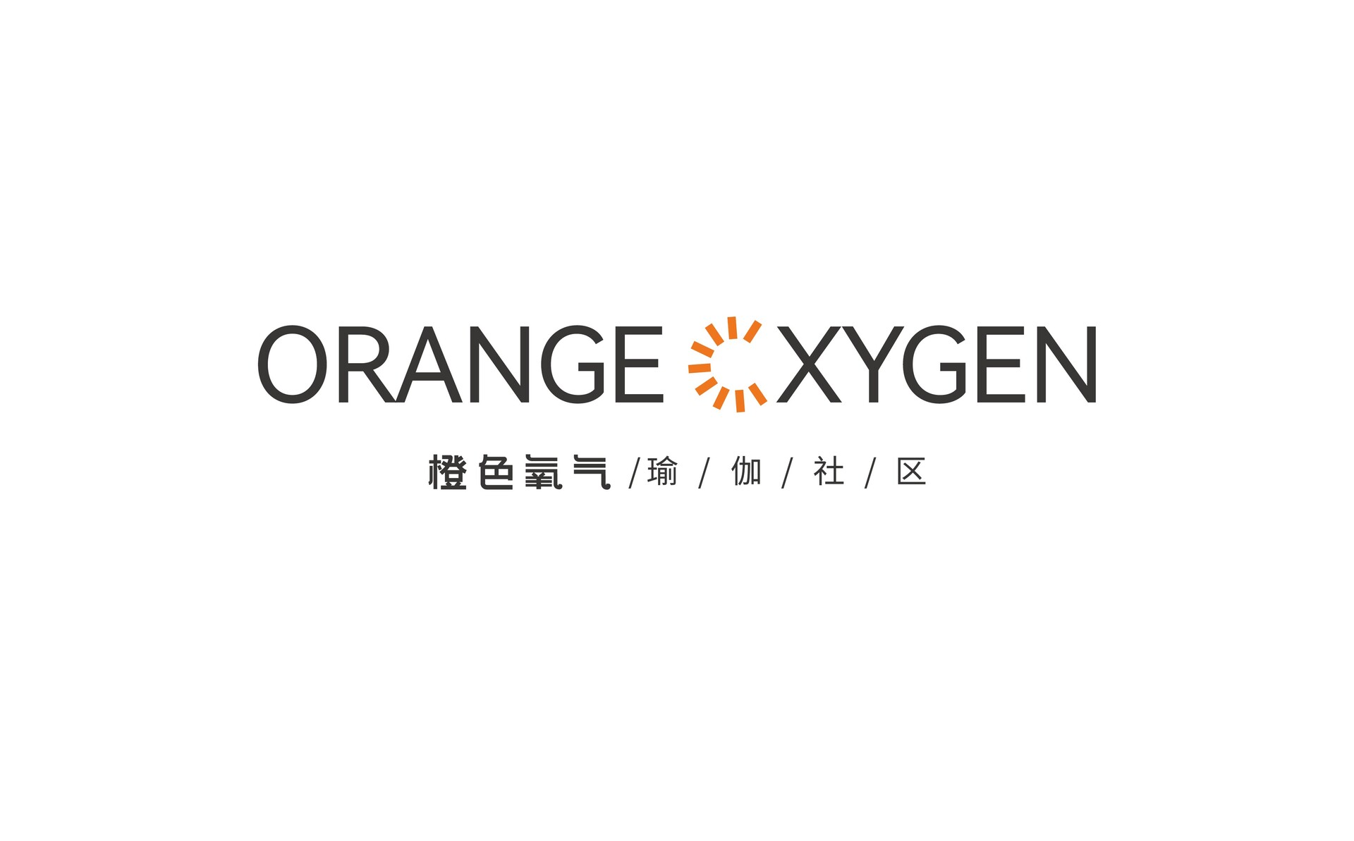
在项目LOGO的设计上,我们首先从橙色氧气的英文品牌名“orange oxygen”中的双“O”获得灵感:
1、 瑜伽代表着自我与大自然的完美结合
2、 氧气是大自然中必不可少的部分,包含自然属性
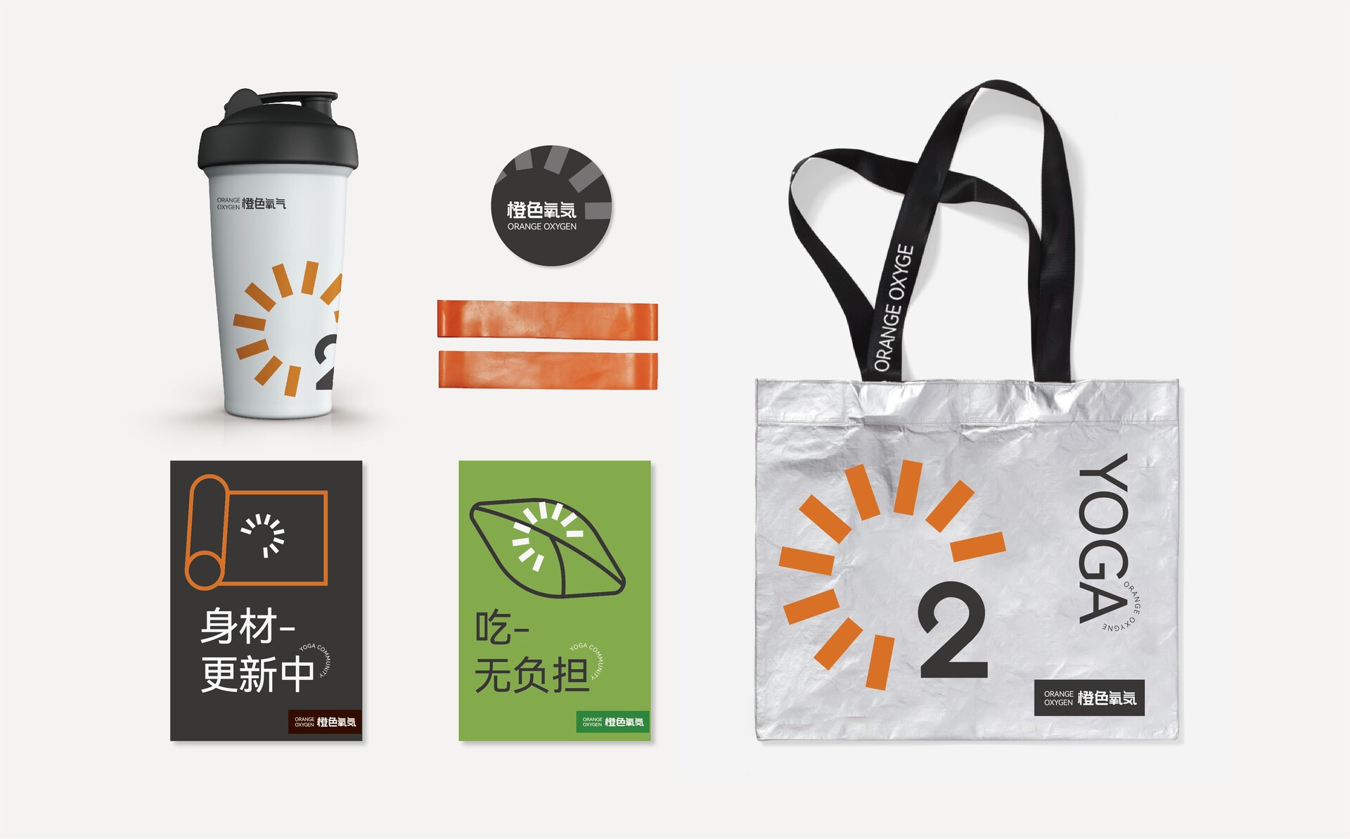
再根据橙色氧气特有的运营模式“不办年卡,按次收费”,我们对字母“O”进行了变化,以半圆的时间刻度为主要图像,体现项目本身收费亮点的同时,结合氧气的化学表达,加入数字2,既直观明了的表达出品牌名“橙色氧气”,同时也向消费者传达出“健康如同氧气一般围绕在每个人身边”的创办宗旨。
Yoga in people's mind is a sport to return to nature and enjoy their own peaceful moments after a tiresome working life. A yoga space that truly aims at consumers' health and allows them to unload their stress and relax is what a yoga studio should have. The design of this project should stand in the consumers' perspective, optimize the experience visually, and satisfy their mental expectations and psychological needs in order to become a reassuring choice for consumers.
Symbolization of the brand name allows consumers to quickly connect the LOGO with the brand, thus quickly establishing a perception of the brand and laying a solid foundation for occupying the mind.
In the design of the logo, we firstly got the inspiration from the double "O" in the English brand name "orange oxygen":
1, Yoga represents the perfect combination of self and nature.
2, Oxygen is an essential part of nature and contains natural attributes.
Based on Orange Oxygen's unique operation mode "no annual card, pay per session", we changed the letter "O" to a semi-circular time scale as the main image, reflecting the program's own charging highlights, and at the same time, combined with the chemical expression of oxygen, adding the number 2, not only expresses the brand name "Orange Oxygen" intuitively, but also conveys to consumers the founding purpose of "health is like oxygen around everyone".

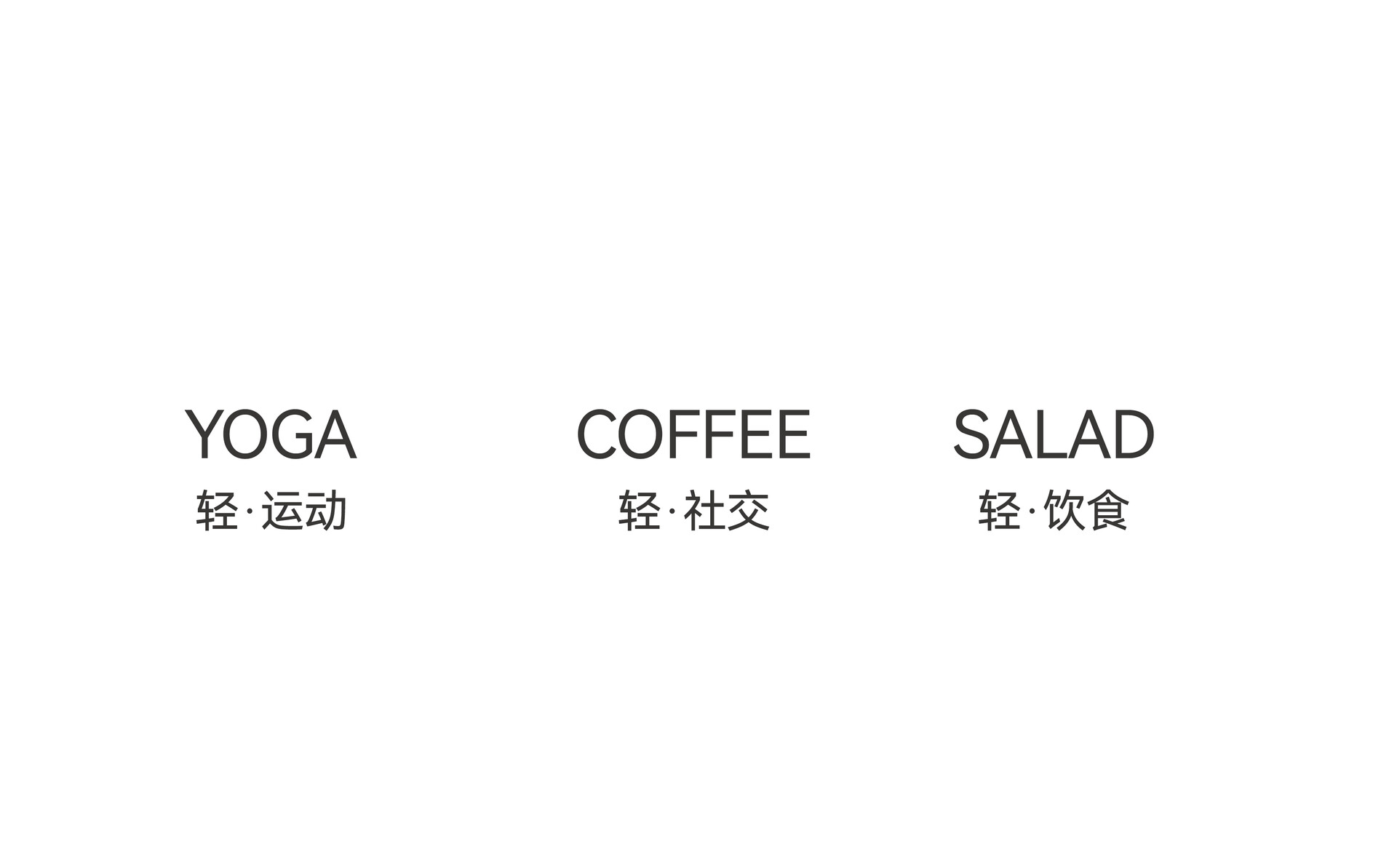
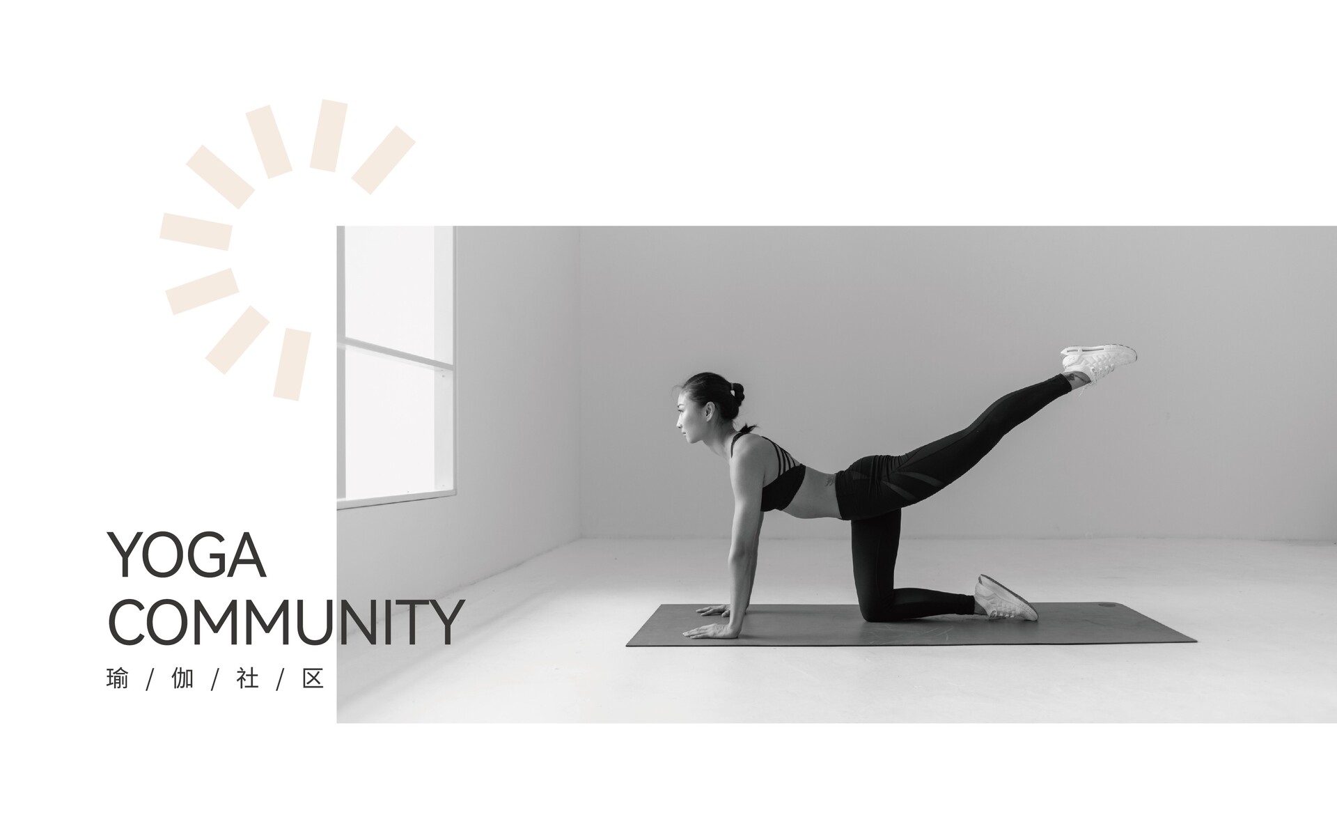
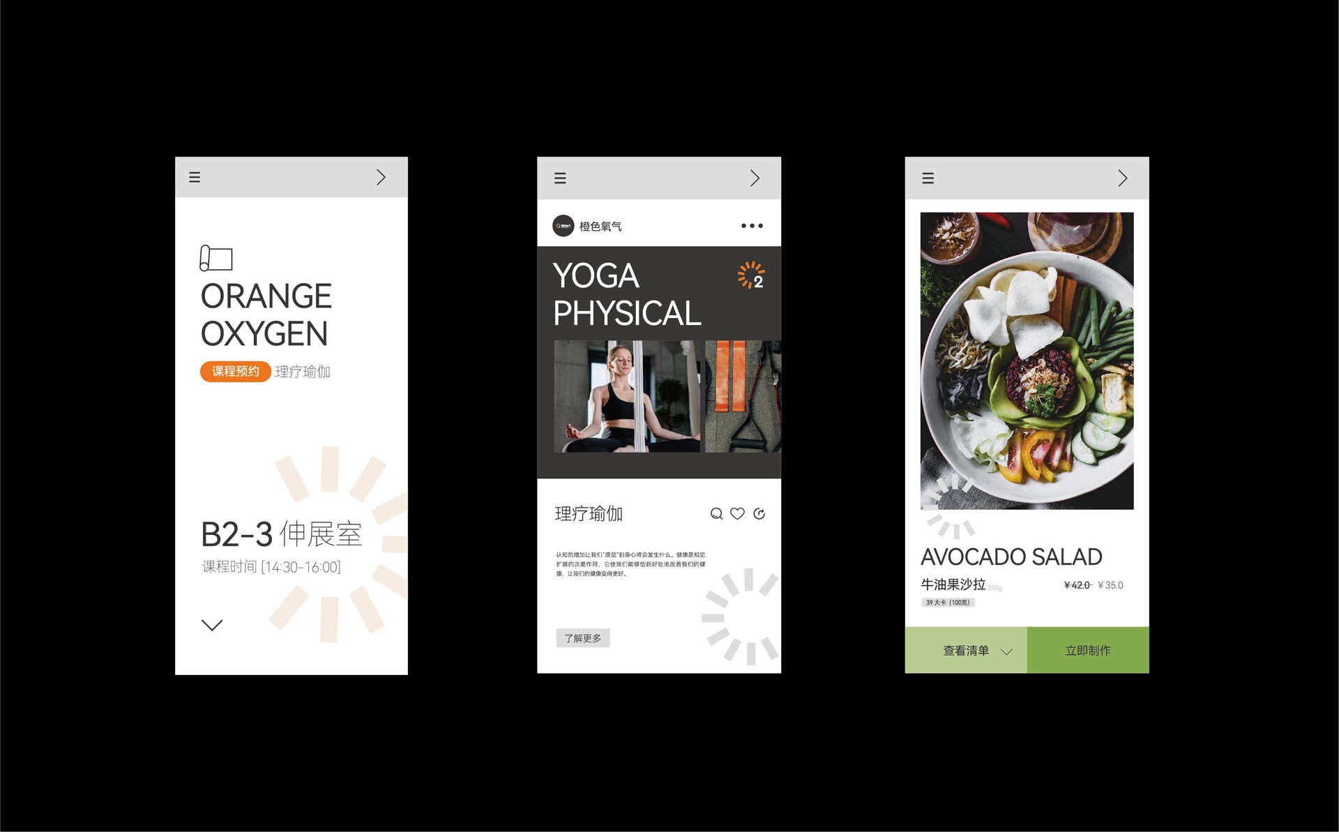
于是我们在LOGO的设计上进行延展加以变化,以橙色氧气瑜伽馆的三大主要属性“运动、社交、饮食”为核心,将其符号化,去阐述瑜伽馆本身应该有的样子。
We hope that every project is not only about buying and selling products, but also about having cultural and emotional links with consumers. In this project, Orange Oxygen is not only a social light space for freeing up the body and mind and pursuing a fine and healthy life in leisure time, but also represents the pursuit of a better life.
Therefore, we extended and changed the logo design, taking the three main attributes of Orange Oxygen Yoga Studio, namely "exercise, socializing, and eating" as the core, and then symbolized it to describe what a yoga studio should be like.
