睿博光电:以光影无界,筑国际智造
本次服务聚焦科技制造光电领域,依托企业顶尖供应链实力与国际化布局,重构品牌视觉体系,传递“无限”的品牌内核,强化企业高端智造的市场认知与行业专属辨识度。
重庆睿博光电股份有限公司成立于2011年,总部位于重庆,先后收购美国及德国两家百年企业。2015年10月,公司完成新三板挂牌,并于2016年4月进入创新层。目前是福特全球战略开发供应商,福特中国唯一小灯供应商,在其国内环境氛围灯领域占据90%以上供应量。
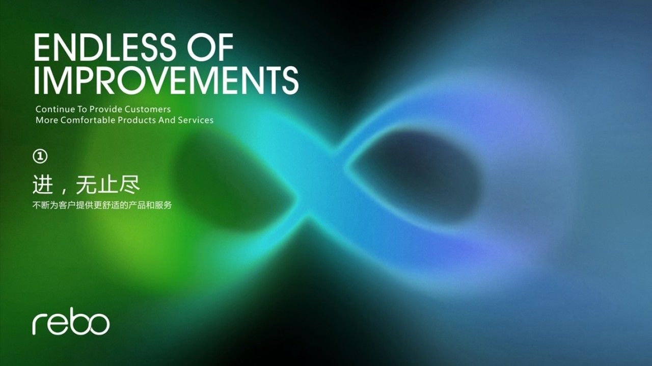
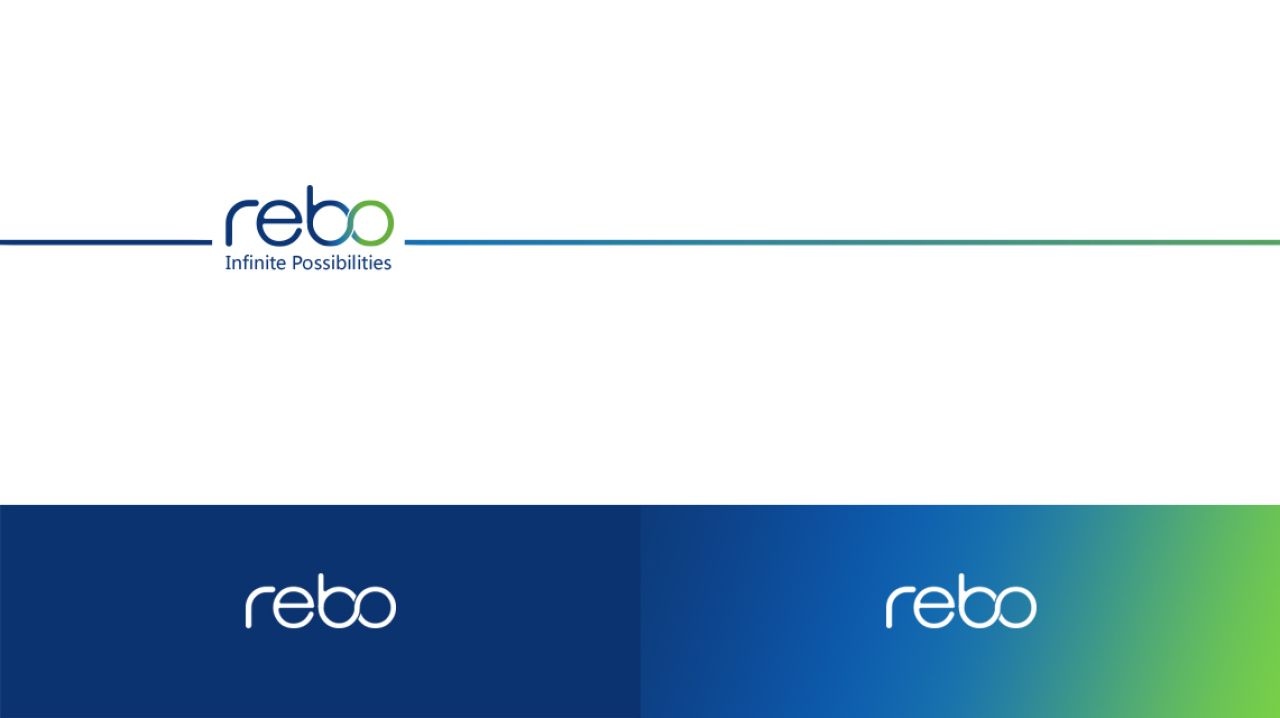
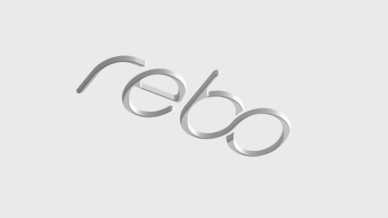
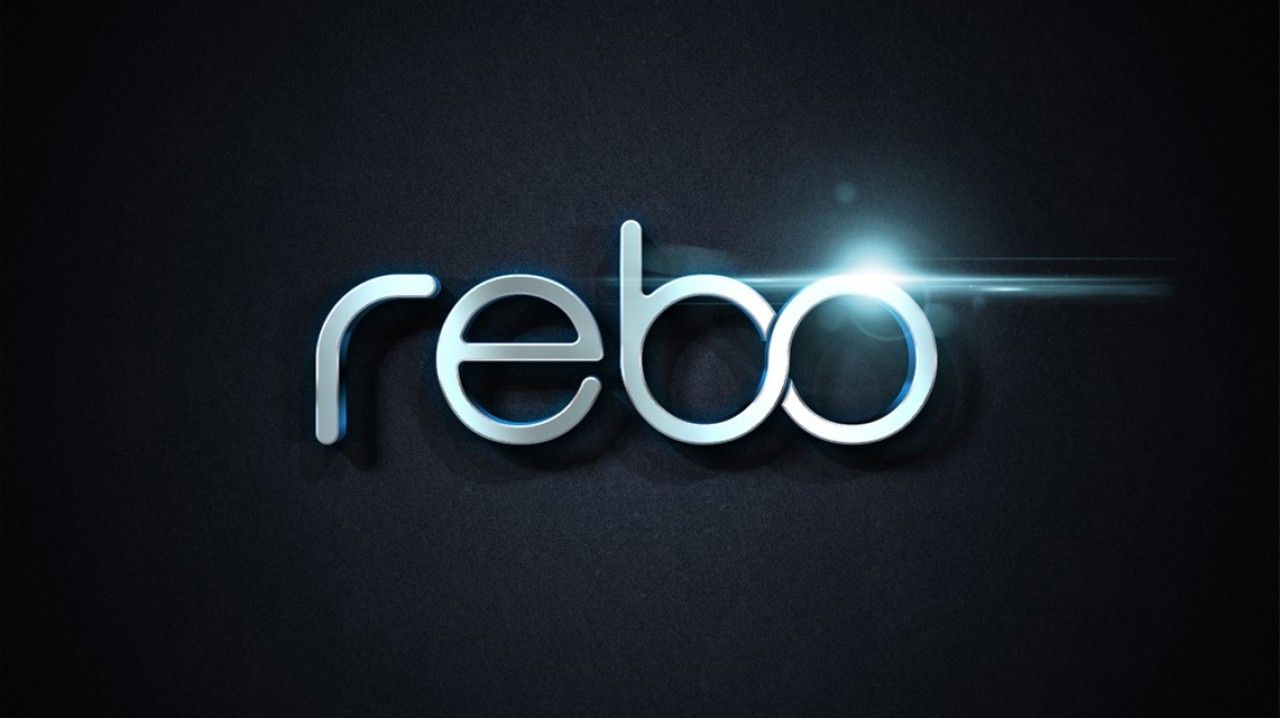
LOGO由“睿博”二字的英文字母拼写组成,字母“BO”与数学符号“∞”联动贯通,传递出互联互通,链接你我的含义。同时,“∞”象征无限的可能,寓意睿博将不断为客户提供更舒适的产品和服务。
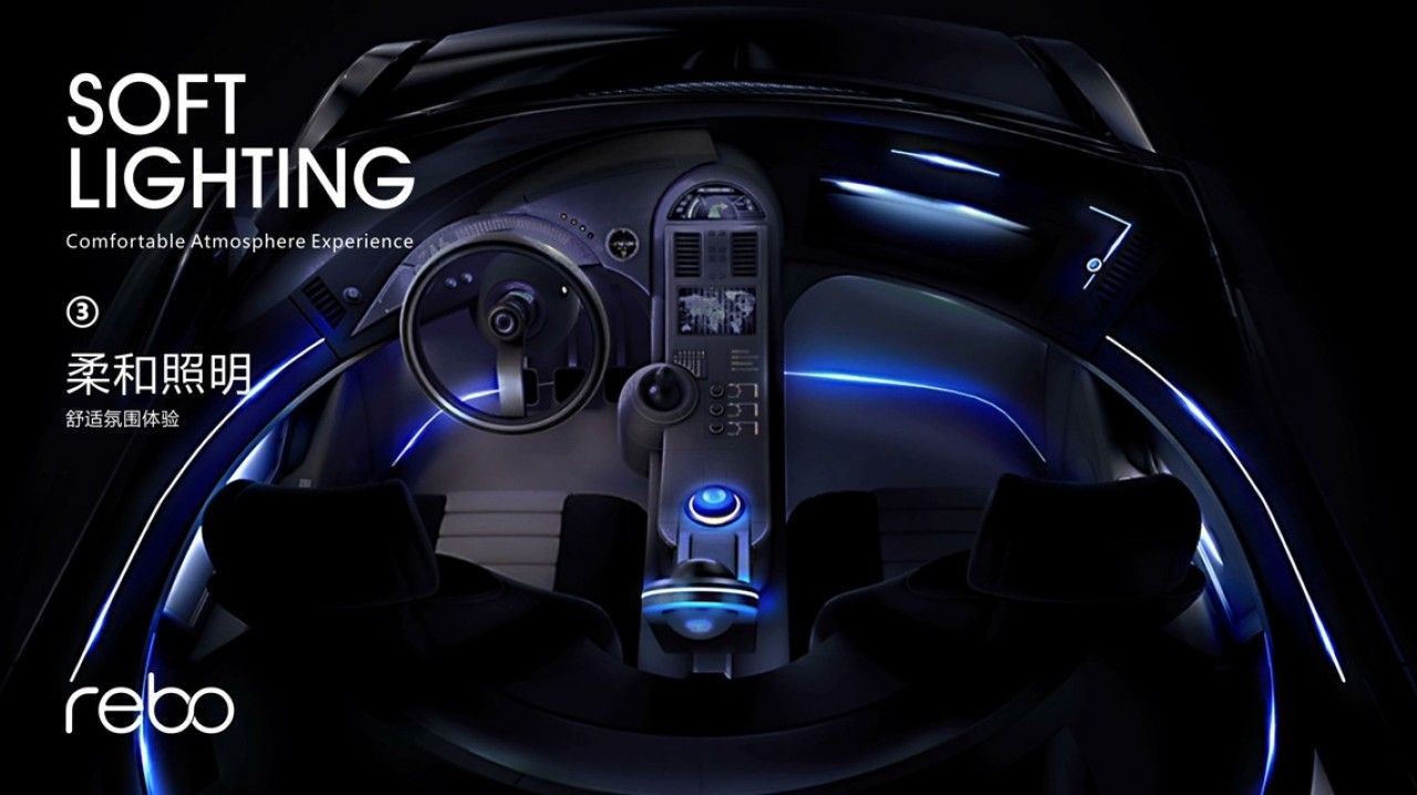
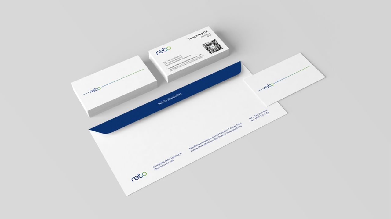
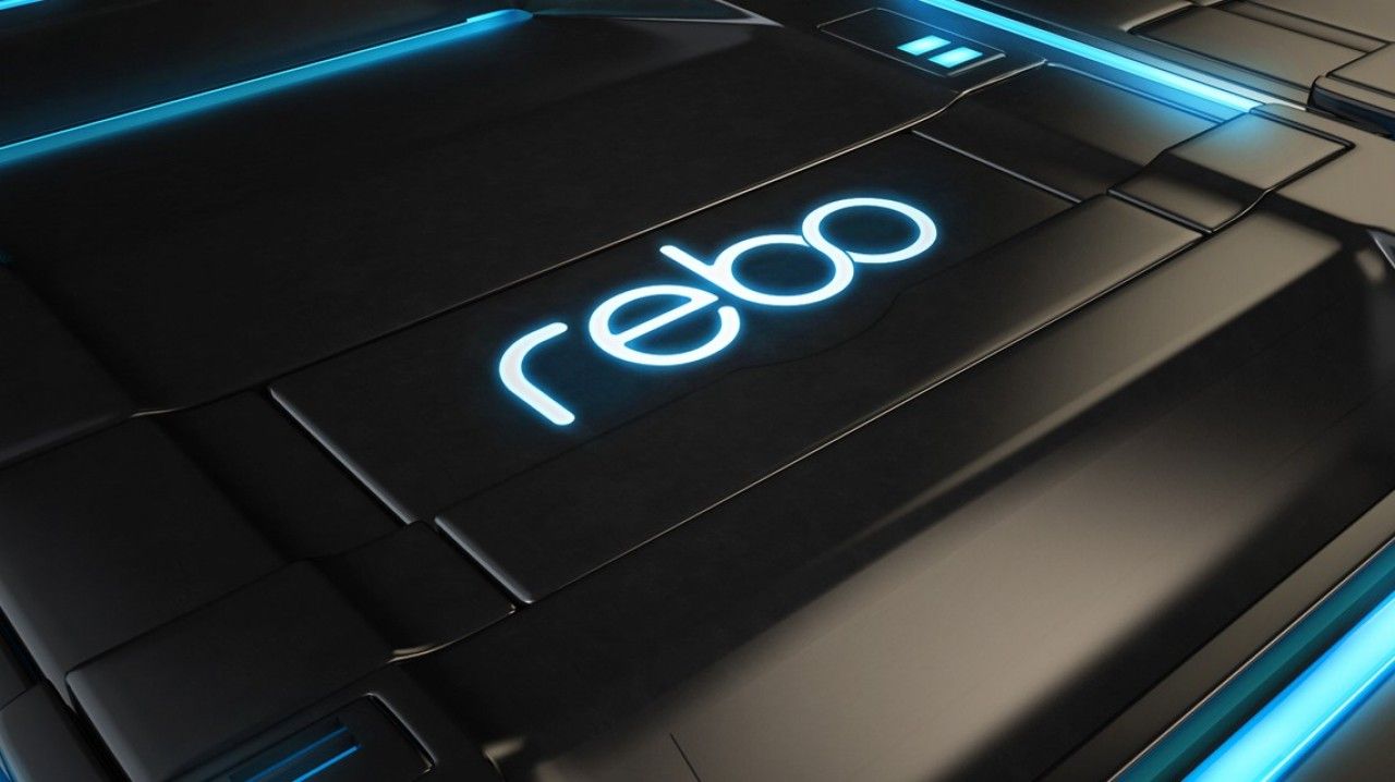
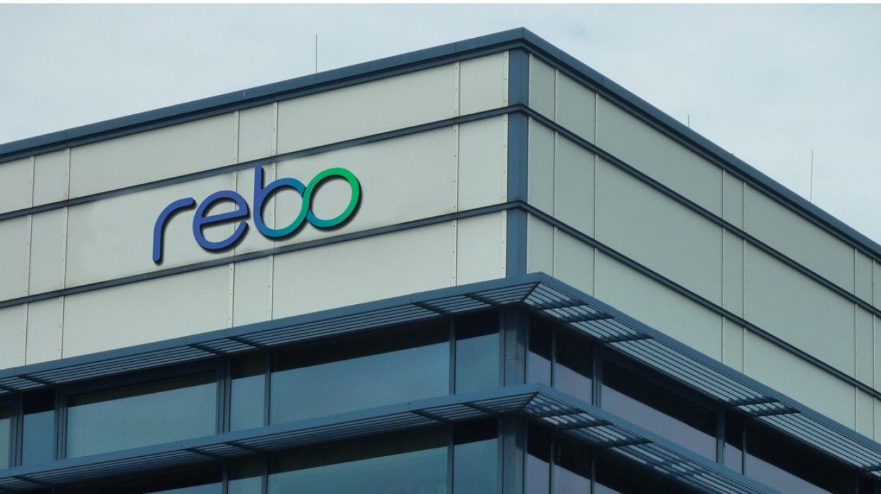
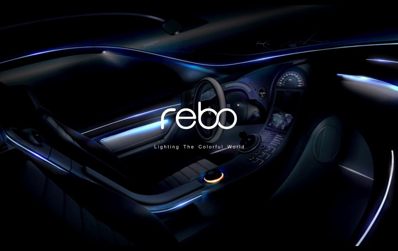
色彩上沿用蓝色为主基调,结合象征生机、活力与舒适的绿色,以蓝色到绿色的渐变,从视觉上诠释出“点亮多彩世界”的概念。此外,光与彩的流动,就像车内的柔光照明,给人以舒适的驾乘体验。除展现公司产品外,也与品牌行业属性相呼应。
企业logo是一个公司象征性的视觉识别符号,通过企业的推广与传播,不断加深客户印象,让客户记住公司主体和品牌文化。同时,作为一个国际性企业的标志设计,应该多维度的思考。因此,在视觉表现上我们综合考虑了国内外相关品牌标志的表现形式。整个图形采用简洁平滑的曲线构成,凸显出国际化、智能化现代企业的特征,希望承载绝大部份客户的文化认同和内容认同。该标志在之后的运用当中,也会有很多创新用法。
The corporate logo is a symbolic visual identification symbol of a company. Through the company's promotion and communication, it continuously deepens customer impression and allows customers to remember the company's main body and brand culture. At the same time, as an international enterprise's logo design, more multi-dimensional thinking should be considered. Therefore, in terms of visual expression, we comprehensively considered the expression forms of relevant domestic and foreign brand logos. The entire graphic is composed of simple smooth curves, highlighting the characteristics of an international, intelligent modern enterprise. We hope to carry the cultural and content认同of most customers. The logo will also have many innovative uses in subsequent applications.